How Michael Spent his Time During Quarantine
Purpose of this Website
COVID-19 was an extremely tumultuous time for everyone, with most people experiencing disruptions to their daily lives and routines. I wanted to quantify the difference in routine that I experienced while transitioning from Amherst College to home. To best express this difference, I created an interactive Shiny app that displays how my routine changed and analyzed the big trends that I noted on this website. Diagrams are interspersed throughout my analysis to highlight crucial components of the app.
Motivating Questions
My primary questions of interest were the following:
- What classes did I spent the most time in during quarantine?
- Is my productivity related to my sleep patterns and, if so, how?
- What time of day am I the most productive? In other words, what time of day do I do the most work?
- How has the total time spent across broad categories that define my daily routine (school, exercise, social, family) changed over time? How has the amount of time I spend in each class changed over time?
- What is the distribution of the amount of time I spent in each category?
My hope was that I could glean some insights from this data about how I structure my time when I am in a less structured environment, my home.
Data collection
I collected data by recording all of the activities that I did over the course of two weeks. I made no intentions of doing these activities at these particular times; data was entered retroactively since the primary objective was to figure out how I structured my time with less explicit structure to my routine.
I explicitly recorded my data into 5 unique classes:
- Data Science
- Evolutionary (Computation, a CS class I was taking at the time)
- Groups (Rings and Fields, ie Abstract Algebra)
- Abnormal (Psychology)
- Work (classified as any activity that was school-related but not under the particular umbrella of a class)
I also tracked each category’s “description” as one of the following:
- Sleep (was asleep)
- School (one of the five classes)
- Exercise
- Family
- Social (eg. Zoom meetings with friends, Netflix party, …)
I also included the particular activity that I was doing. I decided not to include activities in my Shiny app simply because most activities had unique identifiers (eg, Groups HW9 would be different from Groups Study for Quiz). Therefore, it would be difficult to interactively look at how I distributed my time by activity. In addition, I felt that analyzing the time spent in my classes by specific activites was not the objective of my research, providing additional incentive to not include activities in my Shiny app. Analyzing how I spent time in my classes by activity, however, is definitely a good next step for this project.
Each activity had a time stamp (beginning and ending time) and times displayed in the graphs are recorded in CST (Central Standard Time Zone).
Results
Shiny App
I made a Shiny app to display my results. Images relevant to the analysis will be screenshotted and included here, but the link to access the Shiny app is below.
Git unfortunately does not allow for Shiny apps to be embedded in-page, so please click the link here, Link to Shiny app: Diary of a Wimpy Bakshandeh, to open the app.
Total Time spent in Classes over Time
The graph below is presented in my Shiny app, but the dodge histogram, Distribution of Time Spent in Classes, is reproduced at that link for ease of access.
I’ve also included the streamgraph, Evolution of Total Time Spent in Classes- Streamgraph, for an alternative way to visualize the data.
From the streamgraph, it appears that the I do the most work on Mondays and Tuesdays, and the amount of total work that I do decreases as the week progresses. On Mondays and Tuesdays in particular, there appears to be a spike in the amount of work I do in my “Work” class. This is likely because I am a TA for Multivariable Calculus, so I am logging in “Work” on these days that I’m not doing on any other day of the week.
Furthermore, as affirmed by the bar chart and the streamgraph, the class that is the most “time consuming” for me appears to be Groups. There appears to be spikes in the amount of work I do in Groups on Wednesdays and Thursdays (for instance, on Wednesday April 8th I worked on Groups for 4.5 hours). This is likely because we have weekly quizzes in Groups on Thursdays and weekly homeworks due on Thursdays (at 10pm), so I spend some time on Wednesday working through the concepts to prepare for the quiz.
My other classes (Data Science, Evolutionary, and Abnromal) appear not too time-consuming in comparison. There is a spike in the amount of work I did in Evolutionary on Monday, April 13th, and there is also a spike in the amount of work I did in Data Science one week later. Abnromal overall appears to be the least time consuming, since it takes up the least amount of area in the streamgraph. There is one day where I appeared to spend a significant amount of time in Abnormal, but on most other days I appear to only spend around an hour.
Distribution of Categories
We will now look at the how total time spent on activities changed over the course of my two weeks.
I have again included the link to the static summary containing all of the categories here:
As expected, the total amount of time that I spent doing activities remains relatively constant, but there is a noticable dip in the weekend. This supports my theory that I am not nearly as productive during the weekend as I am during the week. It would be interesting to see if this pattern changes once I am back at school.
The amount of time spent exercising appears to be relatively constant, except for the first Friday where I exercised for 4.5 hours. The amount of time that I spent doing schoolwork appears to be greater in the full week that I was recording data than at any other point in the two week interval. Finally, the amount of sleep that I had each night was also relatively constant.
Relationship between Sleep and School
The scatterplot for this one should be viewed interactively, so please look at the Shiny app to see them under the tab that says “Productivity vs. Sleep Patterns.”
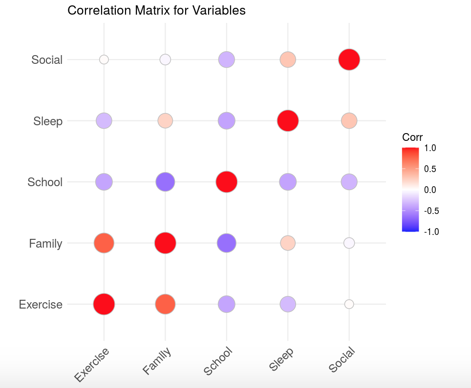
The correlation matrix is displayed here:

In this correlation matrix, as the legend shows, white dots are insignificant correlations, shaded blue dots are negative correlations, and shaded red dots are positive correlations.
There is clearly a negative correlation between:
- sleep and school (as amount of schoolwork increased, the amount of sleep I got decreased)
In addition, there is also a significant negative relationship between:
- school and exercise (as the amount of schoolwork increased, the amount of exercise decreased)
- family and school (as the amount of family time I spent increased, the amount of schoolwork I did decreased)
The interactive version of the correlation matrix provides the specific values of the pairwise correlations.
The amount of time I spent doing social activities was limited, so I am not considering those correlations.
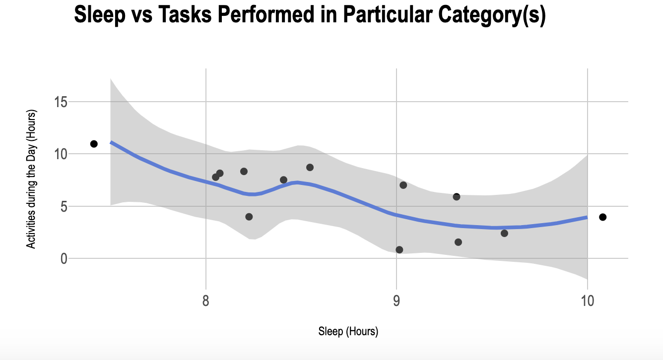
These correlations suggest that I was less productive on the days that I slept more. To validate this claim, I have included the scatterplot that strictly incorporates school and sleep. It is included below:

As the smoothed line shows, there is clearly an inverse relationship between hours of sleep and total time spent on schoolwork. This relationship could be due to going to bed later when I’m doing a lot of schoolwork, or that I feel less motivated to do schoolwork when I am sleeping more.
However, as we add in more categories, the smoothed line becomes flatter. This suggests that there is no significant relationship between how much time I spent sleeping and the amount of time I spent doing structured activities.
What Time of Day Am I Most Productive?
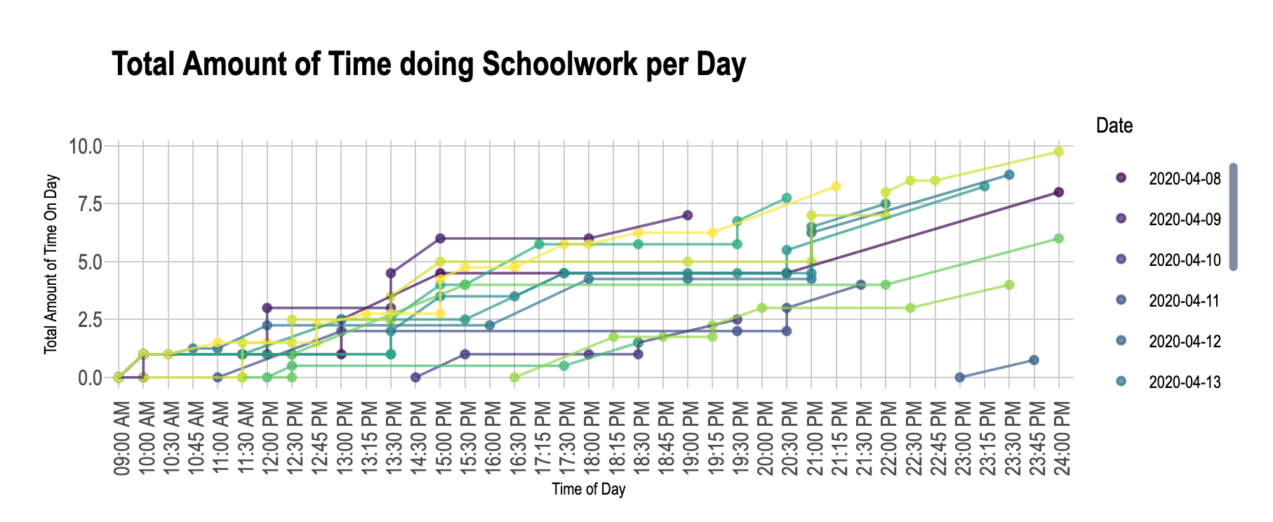
This graph should be viewed in the Shiny app under the “Amount of Schoolwork Throughout the Day” tab, but an image has been included here for illustrative purposes:

There is almost certainly a general pattern here that is immediately apparent. For most days, there is a spike in the amount of work that I am doing early in the day (around 10am EDT). The amount of work that I am doing is steadily increasing until around 2pm EDT. Then, it appears that the work I am doing is plateuing. Right around dinner time, the amount of work done starts to increase again, but this time the work increases at a slower rate. This suggests that my most productive time is in the morning, and then I am slightly less productive in the evening.
Distributions of Categories
I have included the Boxplot showing Distributions of Categories at that link. Similarly, I have shown the Violin Plot showing Distributions of Categories at this link.
From the boxplot, we see that the distribution of sleep (a variable of interest) is left-skewed, with a median time of 8.50 hours. The shape of the violin plot confirms that the distribution of the variable is left-skewed.
On the other hand, we can see that the distribution of the total amount of time spent doing schoolwork is left-skewed. The maximum amount of time spent working on school was 11 hours, and the median amount of time spent was 7.25 hours. The violin plot confirms that the distribution of School is more symmetric than that of sleep, but still right skewed.
The distributions of Exercise, Family, and Social are all left skewed, as evidenced from the boxplots. However, the range of these three variables are all similar: the distributions range from 0 to around 4 hours (except for one point beyond the upper fence of the Family boxplot).
Reflection
How Do I Structure my Time?

Overall, the findings about how I structure my time are not surprising. I suspected that I spent the most time in Groups, and I suspected that I was relatively inefficient in the middle of the day. Furthermore, the distributions of the categories appear to make sense. I aim for 8 hours of sleep a night, so the distribution should have a median value of around 8 hours, and the other distributions should centered around 1 or 2 hours.
The most interesting discovery I made from this data analysis is that the amount of time that I sleep is inversely related to the amount of schoolwork that I do. As I mentioned, it would be interesting to see if this is due to too much work, unproductiveness when I sleep for longer than usual, or a combination of the two factors.
On the Process of Data Collection

This process was the first time that I both collected and analyzed data. It is interesting to reflect on what I learned being on both side of the data analysis process.
First, as some who provides data, I feel that our data should be anonymized (ie, my name should not be given out with my data) whenever it is given out. Furthermore, I would expect that any data that is being collected on me is meant to explicitly benefit me in some way. For instance, if a company is giving my data to an advertising agency, I would expect that the ads would be more tailored to my interests as a result. Similarly, for Google, I would expect that my searches (data I am providing them) are being used to either improve the quality of my top results for searches or to improve the quality of the suggested search terms from Google.
On the other hand, as someone who analyzes other’s data, there is a responsibility to make sure that you are presenting information accurately and that you are presenting the information in an anonymized way. It can often be temptimg to try and present the statistics a certain way when, for instance, you are trying to appease a client. However, it is more important to present your data accurately and present what you have learned from it. Sometimes, not learning anything new or presenting something that someone else wants to see is interesting in its own matter.
For instance, in this project, I didn’t learn anything new about my routine, even though I really hoped that this project would help me learn something new about my routine. I could have tried to present the data in a way that was interesting and revealed something interesting about my routine. However, this would have been unethical to myself and to everyone who views this webpage. Furthermore, this analysis proved to me that my intuitions about how I structure my time are correct. It is a data scientist’s ethical duty to ensure that the information that he is presenting is ethical and anonymized.